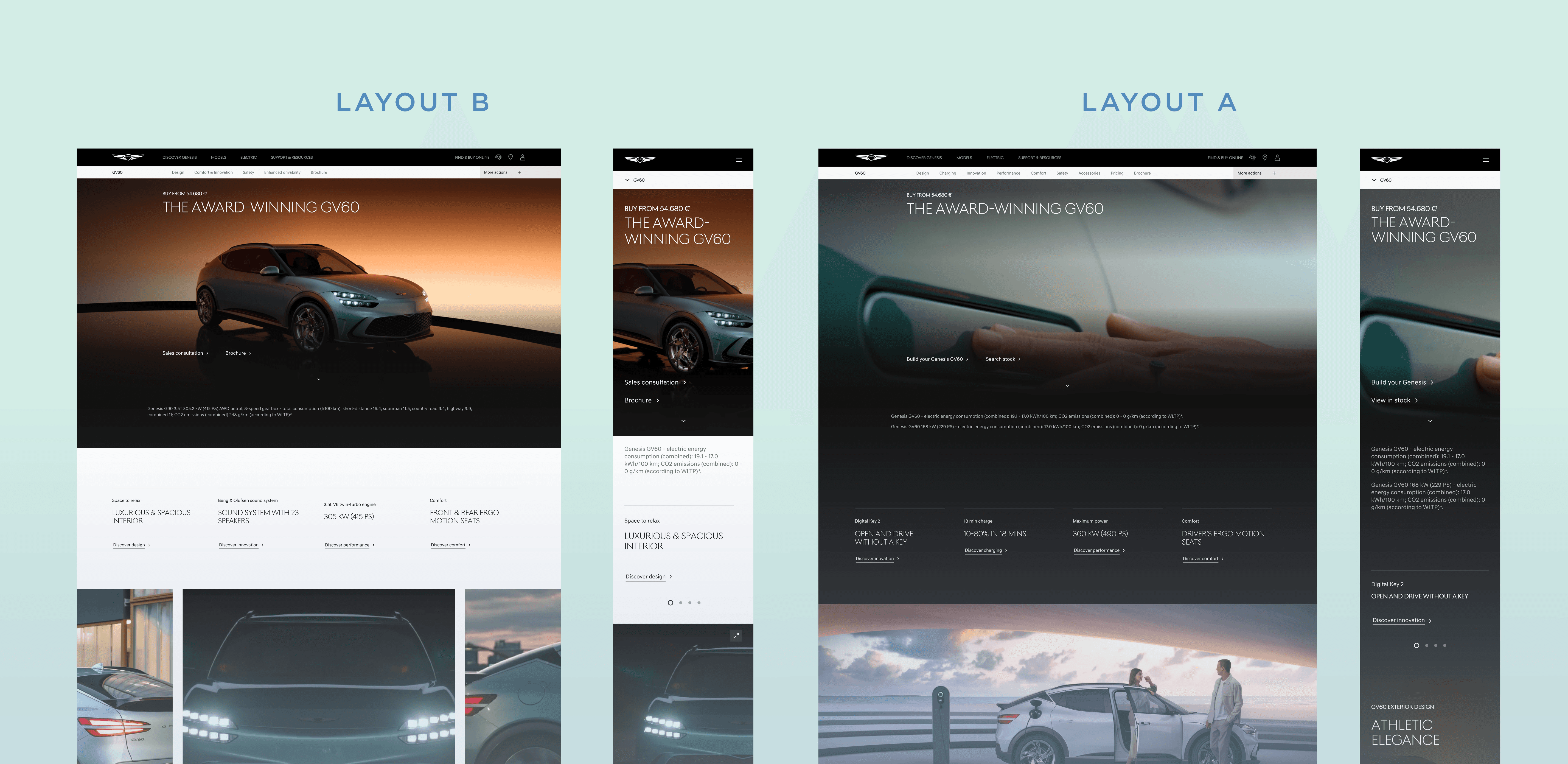
• Genesis Motors Website -

  • Genesis Motors Website -

  • Genesis Motors Website -

Discovery Experience Redesign —

Guiding users from curiosity to confidence.

Guiding users from curiosity to confidence

I led the UX direction for the European discovery experience, focusing on navigation clarity, evaluation flow, and scalable component design.
We redesigned the discovery experience to make exploring the Genesis lineup feel clear, calm, and intuitive from the first moment of interaction.

Client:

Genisis - Hyundai Motor Group

Timeline

2021 - 2023

Role:

Senor UX Designer

Skills:

UX Strategy · Information Architecture · Product Structuring · Journey Mapping · Interaction Design · Prototyping · Design System Thinking · Stakeholder Collaboration

(01 Background)

A new luxury brand entering an unfamiliar market

Genesis entered the European market as a new luxury brand — with strong design identity but low familiarity. Users arrived intrigued, yet struggled to understand how the lineup was structured or how models related to their needs. The digital experience inspired attention, but lacked orientation, narrative continuity and evaluation support.


The core challenge: Transform a visually rich but fragmented experience into a clear, confidence-building journey that guides users from awareness to action — while preserving Genesis’s calm, premium tone and emotional depth.

02 — Research & Insights

Understanding where curiosity turned into confusion

We conducted moderated usability sessions across Germany, the UK, and Switzerland and combined these with platform analytics. Participants included both potential buyers and existing Genesis customers, offering a balanced view of first impressions and ongoing engagement.


02 — Research & Insights

Understanding where curiosity turned into confusion

We conducted moderated usability sessions across Germany, the UK, and Switzerland and combined these with platform analytics. Participants included both potential buyers and existing Genesis customers, offering a balanced view of first impressions and ongoing engagement.


Key Findnings:


Key Findings


01

Low lineup visibility

02

Naming confusion

04

Fragmented exploration

05

Cognitive overload and disconnection

Core insight

03 — Approach

From insight to solution — designing clarity through structure


After identifying where curiosity turned into confusion, we followed a structured UX process to transform the experience. Each phase built directly on research insights and was designed to restore orientation, flow, and trust across the journey.

Guiding users from curiosity to confidence. 

Guiding users from curiosity to confidence. 

01

Map the discovery journey.

We mapped the full path from first impression to configuration and identified where users lost clarity or momentum. This revealed the need for early orientation and a more continuous exploration flow.

Map the discovery journey.

01

We mapped the full path from first impression to configuration and identified where users lost clarity or momentum. This revealed the need for early orientation and a more continuous exploration flow.

02

Restructure content into a natural evaluation sequence.

We restructured model content using content modeling and decision sequencing — aligning the page flow with how people naturally evaluate cars. This defined the foundation for single-page model showrooms.

Restructure content into a natural evaluation sequence.

02

We restructured model content using content modeling and decision sequencing — aligning the page flow with how people naturally evaluate cars. This defined the foundation for single-page model showrooms.

Restructure content into a natural evaluation sequence.

02

We restructured model content using content modeling and decision sequencing — aligning the page flow with how people naturally evaluate cars. This defined the foundation for single-page model showrooms.

Map the Journey

01

We visualized the full path from awareness to configuration, using journey mapping to pinpoint friction points — where users dropped off, lost context, or hesitated. → Outcome: four behavioral moments that guided our redesign — Orientation, Exploration, Evaluation, Decision.

03

Validate improvements through A/B testing.

We ran A/B and multivariate tests on key elements. This allowed us to validate which patterns increased orientation, reduced bounce, and encouraged natural progression — without forcing conversion.

Validate improvements through A/B testing.

03

We ran A/B and multivariate tests on key elements. This allowed us to validate which patterns increased orientation, reduced bounce, and encouraged natural progression — without forcing conversion.

Validate improvements through A/B testing.

03

We ran A/B and multivariate tests on key elements. This allowed us to validate which patterns increased orientation, reduced bounce, and encouraged natural progression — without forcing conversion.

03

Establish a shared structure for repeatable page building.

We defined layout patterns, interaction behaviors and content rules, ensuring that future model pages follow the same evaluation flow and maintain a consistent tone.

Establish a shared structure for repeatable page building.

03

We defined layout patterns, interaction behaviors and content rules, ensuring that future model pages follow the same evaluation flow and maintain a consistent tone.

Establish a shared structure for repeatable page building.

03

We collaborated with the Genesis brand team to integrate the new flow into our design system, ensuring visual consistency, responsive patterns, and brand tone coherence. → Outcome: a unified experience — premium in feel, structured in behavior.

04 — SOLUTION

Final Designs


By restructuring the journey around the four behavioral moments — Orientation, Exploration, Evaluation, Decision — we created a continuous, guided experience that helps users understand the lineup, explore deeply, and move toward configuration with confidence.
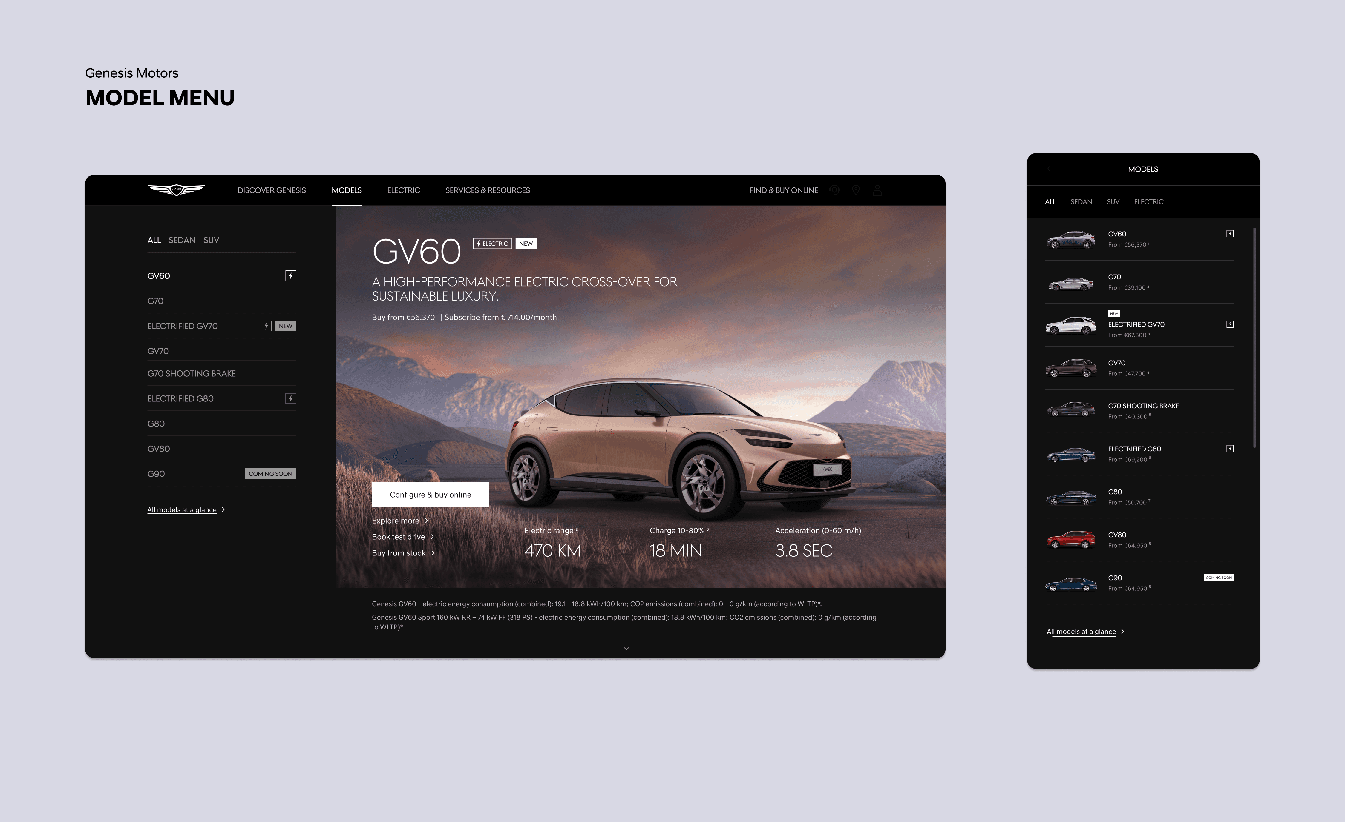
A clear and calm overview of the entire model lineup. 

A clear and calm overview of the entire model lineup. 

The lineup is introduced in one scannable view, with models visually grouped by segment and powertrain, allowing users to orient themselves immediately before exploring further.

A flowing, narrative showroom experience. 

A flowing, narrative showroom experience. 

Each page follows the natural evaluation flow — from first impression to detailed comparison — without requiring users to jump between pages.

A modular library of interactive components used across the entire discovery experience. 

A modular library of interactive components used across the entire discovery experience. 

A scalable component system for all content pages. Teams can assemble new model and content pages quickly while maintaining consistency in structure, pacing and tone.

05 — Results

The redesigned journey increased clarity, confidence and conversion.


The new journey increased clarity, confidence and conversion. More users moved from exploration to action, with higher engagement across model pages and stronger intent signals.
Man Back Pose
Black Man
Woman

+ 20% time on model pages 

+ 20% time on model pages 

+ 31% test-drive conversions 

+ 31% test-drive conversions 

 18% bounce on lineup overview. 

 18% bounce on lineup overview. 

A system designed to scale with clarity and consistency.

The redesigned system is now live across Germany, the UK, and Switzerland.

The rollout demonstrates that a behavior-led structure can scale globally while keeping the experience calm, clear, and consistent.