ROLE
Sen. UX Designer
YEAR
CLIENT
Genesis (Hyundai Group)
Markets
Germany · UK · Switzerland
" height="14px" id="tA21YJivq" width="14px"/></svg>)
UX Research
OVERVIEW
Genesis, Hyundai's new luxury brand, entered the highly competitive European automotive market with a bold ambition: to establish itself among the world's leading luxury manufacturers. As a new name in a market shaped by decades-old brands, the website played a critical role. It needed to introduce the lineup, build trust, and guide potential customers toward their first Genesis experience
As Senior UX Designer, I redesigned the entire discovery experience across Germany, the UK, and Switzerland. This included information architecture, content sequencing, interaction design, and building a scalable, modular framework—resulting in a clear, guided path from first impression to confident choice.


The Challenge
A New Luxury Brand Entering an Unfamiliar Market
Genesis entered Europe as a new luxury brand in a competitive market. The website made a strong first impression and looked visually compelling. However, beneath the surface, users struggled to find the clarity and confidence they needed to take the next step.
The lineup felt difficult to navigate, and key information was hard to find. As a result, many visitors were unsure how to explore their options or take meaningful next steps toward a purchase.
A Clear Opportunity
Research
Understanding Where Curiosity Turned Into Confusion
Before restructuring anything, we needed to understand exactly where and why users lost confidence. A new brand entering an unfamiliar market doesn't have the benefit of recognition, so every friction point carries more weight. We designed a research approach that combined quantitative signals with direct observation across all three target markets.


Problem Statement
Users didn't need more storytelling.
Genesis users arrive with genuine interest but leave without clarity. The site lacks the structure to help them understand the lineup, differentiate between models, and evaluate their options confidently, making it impossible for curiosity to turn into a decision.
Insights
What the Research Revealed
Insight 01 · Low Lineup Visibility
Most participants couldn't tell how many models Genesis offered.
Analytics confirmed the scale: only 10% of visitors ever accessed the full lineup. The portfolio was present on the site, but effectively invisible in practice.
Insight 03
The alphanumeric naming system blurred distinctions between sedans, SUVs, and EVs.
odel names like G70, GV80, and Electrified GV70 caused genuine misreading. Without a clear naming logic, comparison was impossible before it even began.
Insight 03 · Fragmented Exploration
Each model was spread across multiple subpages
Participants repeatedly described it as "too much work to understand a single car", forcing users to piece together basic information from different sections. Evaluation momentum collapsed before purchase intent could form.
Core Insight
Users didn't need more storytelling.
They needed a clear structure that supports how people actually evaluate cars: from first impression, through model comparison, to a confident decision. Interest was already there. The opportunity was structure.


Design
A System for Vehicle Discovery
The previous experience broke down at two critical points: entering the lineup and exploring individual models. The redesign addressed both issues through a connected system built around actual user behavior.
01 · Navigation built around the lineup
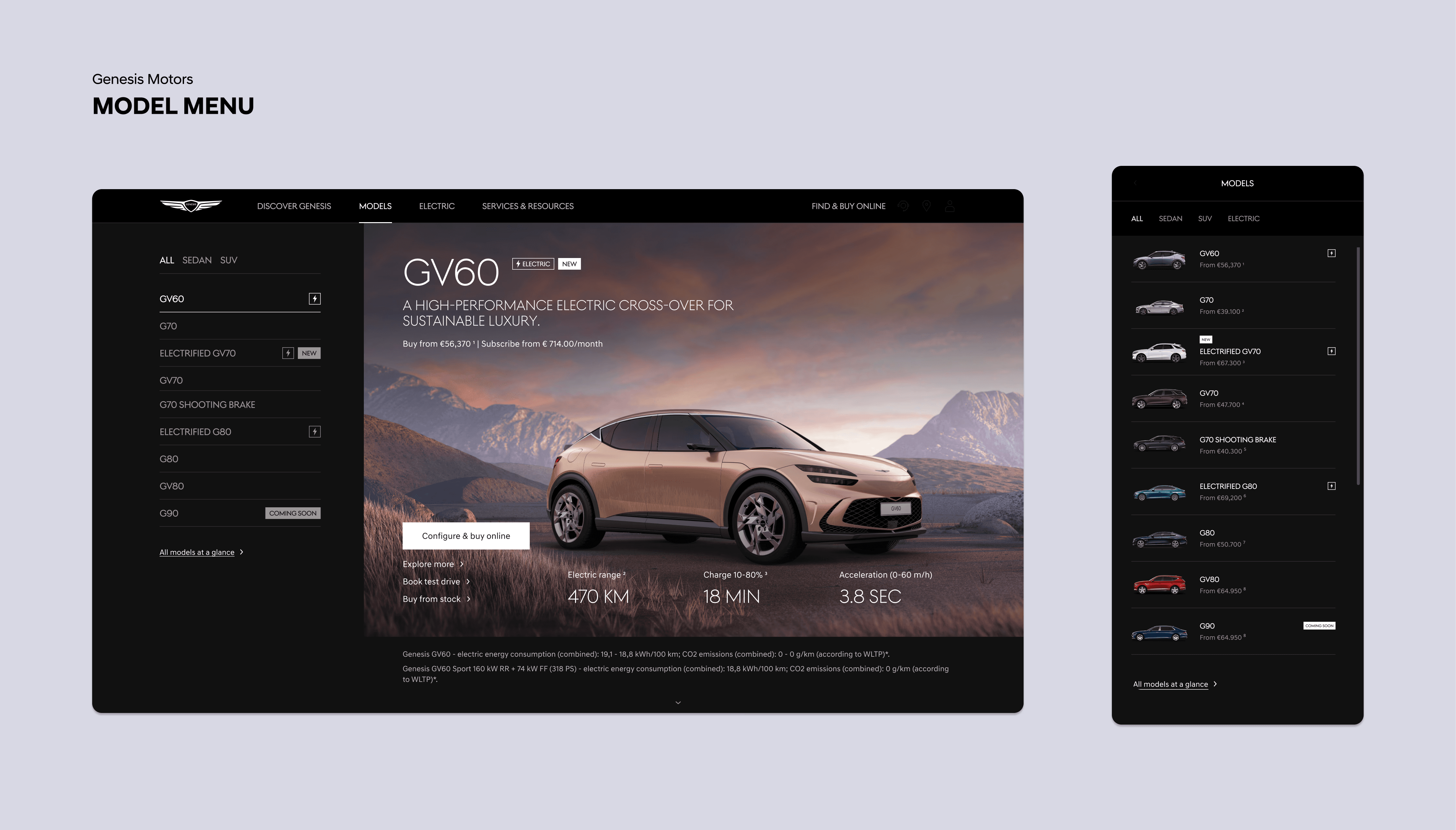

Users previously struggled to understand the lineup because the tile-based menu fragmented the portfolio, causing confusion. We introduced a single, structured entry point that made all models visible at once, clearly identified as sedan, SUV, EV, or ICE. For the first time, users could view the entire Genesis range at a glance and immediately understand each model’s place within it.
02 · Single-page showrooms


Previously, exploring a model required navigating multiple subpages, which users often described as "too much work." We consolidated all content into a single, structured showroom page, following a clear evaluation flow: design and exterior, interior and comfort, performance and range, safety and technology, and pricing and trims. Key conversion actions—Test Drive and Build & Order—remained accessible throughout, ensuring uninterrupted exploration.
03 · Standardized content framework


A modular AEM component library replaced custom page builds. Reusable templates standardized content across the full lineup, reduced time-to-launch for new models, and provided editorial and production teams with a consistent foundation. Every future launch now benefits from the same evaluation structure and interaction quality.
Impact
Rolled out across Germany, the UK, and Switzerland, this clearer structure produced measurable improvements at every stage of the funnel.
Clarity at first glance
18% Reduction in bounce on the lineup menu
A structured lineup entry made the full range easy to understand, reducing early drop-offs before exploration began.
Everything in one flow.
20% Increase in time on model pages
By consolidating showrooms into a single guided page, users moved seamlessly from exploration to decision-making, rather than abandoning the journey midway through.
From clarity to action.
31% Increase in test-drive conversions
A clear lineup and consistent showroom experience guided users toward meaningful actions throughout the entire journey.