IWC Schaffhausen – App Redesign

IWC Schaffhausen –
App Redesign

YEAR

2023 - 2024

ROLE

Senior Product Designer

ROLE

UX Lead

YEAR

2022 - 2024

CLIENT

IWC Schaffhausen

UX Strategy

UX Strategy

App Design (Android and iOS)

OVERVIEW

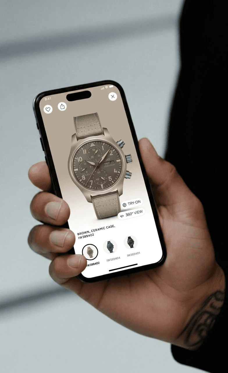
This case study covers how a fragmented, campaign-driven app was restructured into a product-led experience that helped users get to know individual products and connect more deeply with the brand.

I led the UX process end-to-end, from research and architecture through to design system definition and final handoff. This included moderated user research, customer journey mapping, information architecture, interaction design, and overseeing the modular design system that underpinned the entire relaunch.

Download App ↗

Download App ↗

RECOGNITION

· German Digital Award (Gold)

· Red Dot Award (Communication Design)

The Challenge

An App of Silos

The app had strong features but no structure to connect them. Navigation, product pages, and AR Try-On each worked in isolation, leaving users with no clear path from interest to purchase.

App Store reviews and analytics confirmed it: high engagement, low conversion. Additionally, launching new collections without a shared system was slow and inconsistent, making scalability a business problem as much as a design one.

IWC Schaffhausen built the app as a brand experience. Users could access various features and engage with individual moments, but rarely progressed toward conversion. The experience was immersive in parts but fragmented overall, making it difficult for users to move from interest to action.

That same gap showed up on the business side: without a shared system, every new collection meant building pages from scratch, slow to launch and inconsistent with everything that came before.

The Challenge

An App Without Direction

Before the redesign, isolated features created a confusing experience, one that drew users in but rarely led anywhere.

Research

Understanding Where Momentum Was Lost

Before designing anything, we needed to understand what the app was actually doing to users, not what we assumed it was doing. We defined a research strategy built around four steps, moving from quantitative signals to qualitative depth, and from observed behaviour to prioritised direction.

01. Analytics & App Store Ratings

We started with what the data already knew. Existing app analytics showed us where users entered, where they stalled, and where they left. App Store ratings and reviews added a layer of unsolicited honesty, users describing in their own words what wasn't working. Together, these established a baseline that grounded everything that followed in observable behaviour rather than assumption.

02. Remote Interviews

03. Moderated Usability Testing

04. User Journey Mapping & Pain Point Prioritisation

01. Analytics & App Store Ratings

We started with what the data already knew. Existing app analytics showed us where users entered, where they stalled, and where they left. App Store ratings and reviews added a layer of unsolicited honesty, users describing in their own words what wasn't working. Together, these established a baseline that grounded everything that followed in observable behaviour rather than assumption.

02. Remote Interviews

03. Moderated Usability Testing

04. User Journey Mapping & Pain Point Prioritisation

Insights

What the Research Revealed

Insight 01

Navigation followed content, not the watches.

The structure of the app was built around campaigns and editorial formats rather than the collection itself. Users who arrived curious about a specific model had no clear starting point. The watches were present but never front and centre.

Insight 03

Engagement was strong. Conversion was not.

AR Try-On was one of the most-used features. Campaign launches generated genuine emotional impact. But these moments led nowhere. Users engaged deeply and then stalled, with no natural next step toward evaluation or purchase.

Insight 02

Every product page was built from scratch.

Product pages followed campaign logic rather than a shared framework. Each new launch introduced different layouts and interaction patterns. Without a consistent structure, users struggled to compare models, and the team struggled to scale launches without losing quality.

Core Insight

Strong Features. No Structure.

The app created moments. It didn't create momentum. Three structural changes were needed: a navigation built around the watches, a consistent page system, and AR Try-On embedded where it could actually convert.

How Might We

Each insight was reframed as a How Might We question:

Three insights. Three questions. Three principles. Each HMW question translated a structural problem into the design direction that resolved it.

"How might we reduce noise so the watch and the path to it are always visible?"

Principle 01 · Clarity

"How might we connect inspiration directly to intent, so engagement doesn't end in a dead end?"

Principle 02 · Conversion

"How might we replace one-off page builds with a shared system that scales without losing quality?"

Principle 01 · Clarity

"How might we reduce noise so the watch and the path to it are always visible?"

Principle 01 · Clarity

"How might we connect inspiration directly to intent, so engagement doesn't end in a dead end?"

Principle 02 · Conversion

"How might we replace one-off page builds with a shared system that scales without losing quality?"

Principle 01 · Clarity

Approach

Three Principles to Resolve One Problem

From three HMW questions, three principles emerged. Not as separate fixes, but as a connected framework addressing the one thing the app was missing: structure.

Woman
Woman

01. Clarity

Guide, don't overwhelm 

Guide, don't overwhelm 

Present relevant information at the right time. Minimize distractions so products and their pathways remain clear.

02. Conversion

Bridge Inspiration and Intent 

Bridge Inspiration and Intent 

Ensure each engaging moment advances the user. Transform discovery into decision-making.

03. Continuity

Build for Scale 

Build for Scale 

Design a unified system that connects all interactions. It should be consistent to build trust and flexible to support growth.

Design

From Principles to Product

Each principle translated into a concrete structural change. Three decisions, each directly addressing one of the three root causes identified in research, and together forming one coherent experience.

01. Navigation & Search

Less Noise. More Direction.

From content destinations to a product-led structure.

Four of the five previous navigation items were content destinations. The watches shared equal weight with a podcast and an arcade game. We rebuilt navigation around the collection, consolidating content into a single Inspiration tab and unified Search, so the watches are always front and centre.

02. AR Try-On (Conversion)

Curiosity, Now Connected.

From standalone feature to purchase moment.

AR Try-On was powerful but isolated. Users tried watches on and had nowhere to go. We moved it directly onto the product page, at the exact point where purchase intent is highest, turning a dead end into a natural progression toward the IWC web shop.

03 Modular System

One System Behind Every Watch.
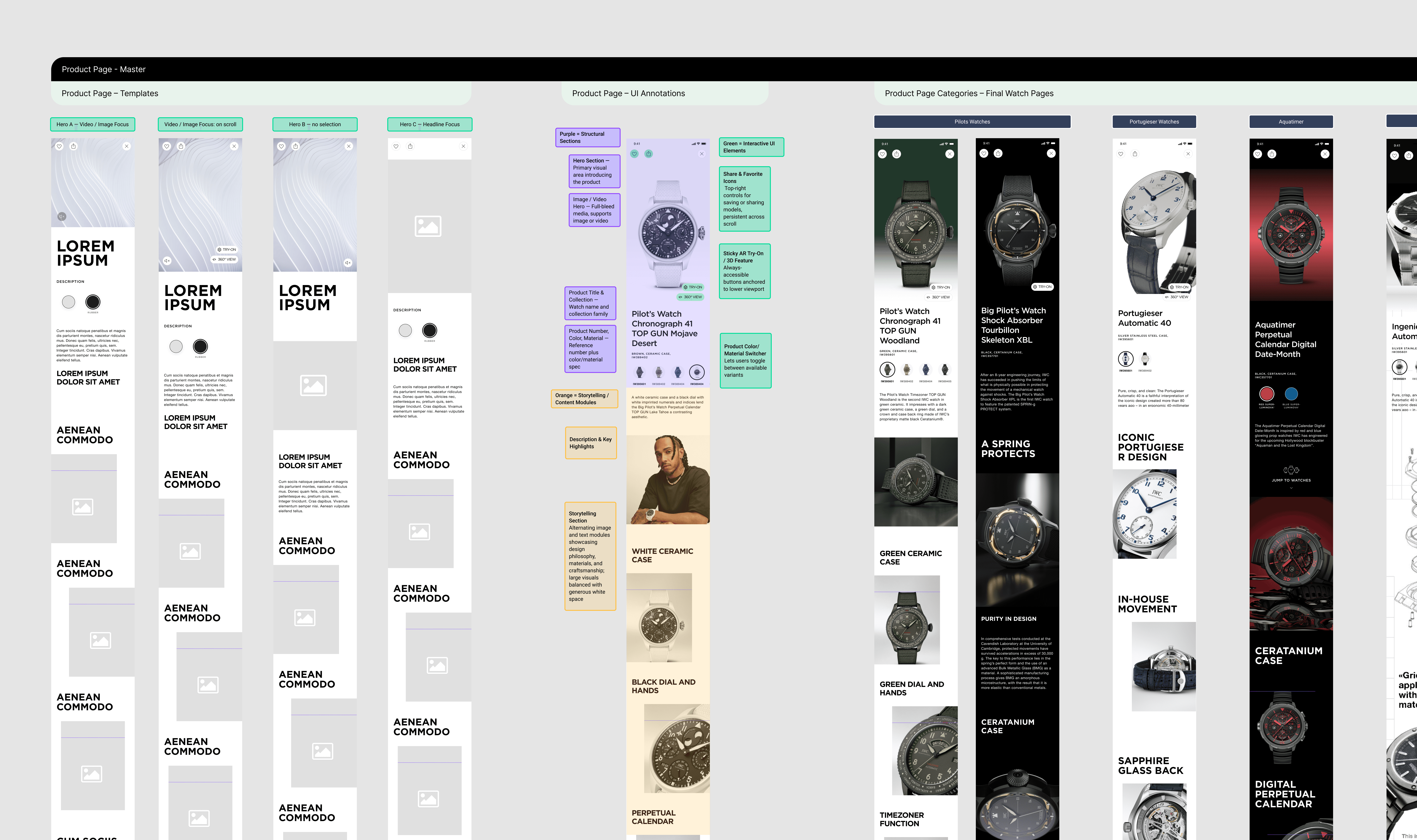
From one-off builds to a system that scales.

A unified modular template replaced the campaign structures that made each product page feel different.

Previously, every launch meant starting over. The new modular system gives every watch the same considered structure, with room for campaign expression built in, so quality no longer depends on how much time a launch allows.

The system, applied.

One watch, every module in sequence. Structure holds. Expression adapts. The same foundation, built to carry any collection.

Impact

Clarity, Conversion, Continuity — Confirmed.

Three principles, three structural changes, and results that validated all three. The redesign didn't just improve individual metrics, it connected them, turning engagement into conversion and conversion into a scalable foundation.

User satisfaction

4.7 App Store Rating

A more focused, intuitive experience was reflected in improved user ratings.

Deeper engagement

+19%Time spent in app

Users spent more time exploring watches after content and navigation were aligned with the product journey instead of competing with it.

Stronger retention

22% Reduction in bounce rate

A clearer structure and guided flow kept users engaged, reducing early drop-offs.

From app to purchase

+14% Conversion to e-commerce

Integrating AR Try-On into the product journey and clarifying the path to the web shop transformed the app into an effective conversion driver.

German Digital Award

Gold · Best App Experience · 2023

Red Dot Award

Communication Design · 2023

User satisfaction

4.7 App Store Rating

4.7 App Store Rating

A more focused, intuitive experience was reflected in improved user ratings.

Deeper engagement

+19%Time spent in app

Users spent more time exploring watches after content and navigation were aligned with the product journey instead of competing with it.

Stronger retention

22% Reduction in bounce rate

A clearer structure and guided flow kept users engaged, reducing early drop-offs.

From app to purchase

+14% Conversion to e-commerce

Integrating AR Try-On into the product journey and clarifying the path to the web shop transformed the app into an effective conversion driver.

German Digital Award

Gold · Best App Experience · 2023

Red Dot Award

Communication Design · 2023