ROLE
YEAR
CLIENT
Miles & More / Lufthansa Group
PARTNER PROGRAM
Marriott Bonvoy
UX Strategy
Journey Design
OVERVIEW
Miles & More and Marriott Bonvoy have formed a new partnership, enabling members to link accounts and access shared benefits across both loyalty programs. While the technical integration was underway, the member experience had yet to be defined.
I designed a comprehensive new member journey to help users understand the partnership, how points and benefits integrate, and how to use their new status. This experience was delivered across email, app, and web in time for launch.


The Challenge
Each loyalty program has distinct status tiers and benefits, which adds complexity when combined. Different member types require tailored explanations of how the partnership affects their experience.
Without a clear journey, members may become confused about the partnership, potentially resulting in low engagement despite the new connection.


Approach
A workshop-driven methodology, grounded in user research
We used user research and a workshop-led process to define the audience, map needs, design the journey, and create concrete components. Research insights informed every decision, ensuring the journey reflected actual member behaviors. Segmentation enabled personalization, while available touchpoints determined feasibility.

What shipped first
From scoring to a phased rollout
Components were staged for rollout by value and effort, ensuring the most impactful elements launched first across all channels.
Quick wins launched first, followed by major features and supporting tasks, while low-impact items were deprioritized.

Quick wins shipped first, delivering the most member value for the least build effort. Big deals followed, some delivered at launch alongside the quick wins, others staged for a later phase once that foundation was live. Filling tasks rounded out the experience without holding up launch, while ungrateful tasks were deprioritised, their impact didn't justify the effort at this stage.
Solution
Four phases, now in production
The approach resulted in four live phases:
Confirm connection
→
Guided onboarding
→
Points & progress
→
Recommendations
Each phase serves a distinct purpose, and together they guide members from initial reassurance to ongoing, active use of the partnership.
Confirm connection

Confirmation appears immediately on any platform the member uses, providing the first indication that both programs now work together. Displaying this promptly prevents uncertainty about whether the connection was successful.
Guided onboarding

A guided, scannable walkthrough introduces how the programs work together and what current status unlocks. Built as a moment rather than a help article, it puts the answer in front of members instead of behind a link most would never click.
Onboarding Banner (Web)
Onboarding Walkthrough (App )
Points & progress

Status, points, and key benefits remain visible at all times in the cockpit and status widget. Maintaining this visibility, rather than explaining them only during onboarding, encourages members to actively engage with the partnership.
Status Widget (Web)
Cockpit (App)
Personalized recommendations
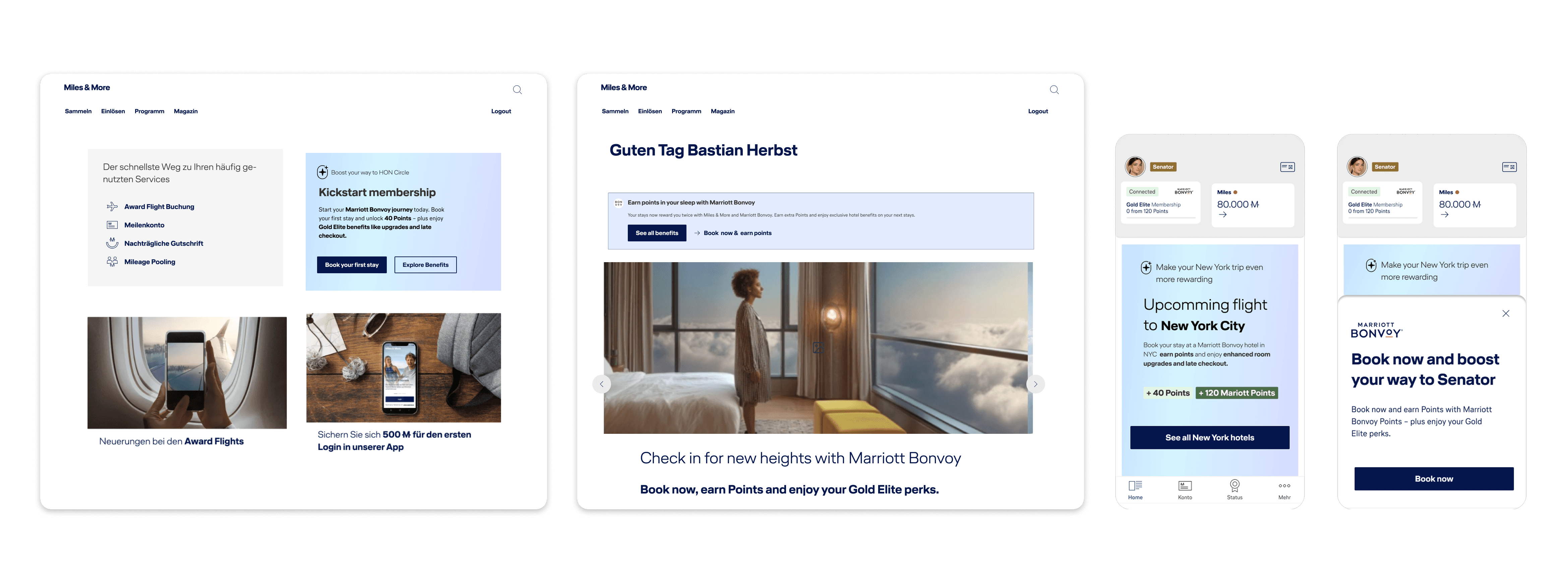
Recommendations stay specific and contextual, a hotel at an upcoming destination, rather than a generic prompt. The specificity is what closes the gap between knowing a benefit exists and actually using it.
Contextual Banner
Recommender Slot / Card
App Bottom Sheet
End-to-end flow

Branching by device, always arriving in the same place
Regardless of entry point, every path leads to a single personalized destination, ensuring members consistently understand the partnership, regardless of their journey.
Beyond Onboarding
From First Connection up to Continuous Engagement
Onboarding marks the start of an ongoing relationship. Each touchpoint was designed to evolve after initial use, adapting to changes in status, behavior, and travel plans to keep the partnership relevant over time.

For example, notifications may initially announce the partnership, then later remind members about expiring points or prompt them toward upcoming milestones. Content evolves as the member’s status and usage change.
Measuring Success
Defining What Good Looks Like at Every Step
Success depended on member adoption, so each journey stage was paired with KPIs to measure engagement and optimize the experience.


⚠️
For confidentiality reasons, the resulting figures can't be shared here.
Results demonstrated strong early adoption and engagement throughout the onboarding flow, validating the chosen approach.